Creating insightful and visually appealing sales KPIs (Key Performance Indicators) is crucial for data-driven decision-making in any business. One powerful visualization technique that can help simplify complex data is the Venn Diagram. In this article, we’ll explore how to create a Venn Diagram-style Sales KPI in Power BI, making it easier to compare and analyze sales data.
Why Venn Diagrams are Effective
Venn diagrams offer a unique and effective way to represent data, especially when dealing with overlapping datasets. Their visual intuitiveness allows for easy comparison and identification of relationships between different metrics. In the context of sales KPIs, this can be particularly useful for understanding how different aspects of your sales performance intersect and influence each other.
Preparing Your Data
Before you start building your Venn Diagram KPI, it’s essential to prepare your data properly. This involves cleaning and organizing your sales data, as well as identifying the key metrics that you want to include in your diagram. Ensure your data is accurate and consistent to avoid misleading insights. Key metrics might include total customers, total sales, and total quantity of products sold.
Setting Up Power BI
Once your data is prepared, you need to import it into Power BI. Select the appropriate data source and follow the steps to load your sales data into the Power BI environment. Familiarize yourself with the Power BI interface and available visualization tools. Choosing the right tools will streamline the process of creating your Venn Diagram KPI.
Creating the Venn Diagram
This section will guide you through the process of designing and building your Venn Diagram in Power BI. You’ll learn how to create the basic layout, customize the colors and labels, and add interactive elements to enhance user experience. The goal is to create a visually appealing and informative representation of your sales data.
Analyzing and Interpreting the Results
Once your Venn Diagram is complete, it’s time to analyze and interpret the results. Identify key insights from the diagram and use them to drive business decisions. Understand how the different metrics interact with each other and how they contribute to your overall sales performance. This will help you make informed decisions and improve your sales strategies.
Building the KPI
We will go through these steps:
1. The DAX Function we will be using:
Total Customers = COUNT(Table1[Customer ID])
The formula Total Customers = COUNT(Table1[Customer ID]) will give you the total count of entries in the “Customer ID” column, which essentially represents the number of customers.
2. Creating the KPI Base:
- Go to the Insert tab and select Basic Shapes(Oval).
- Expand Style and in Color use #F2F2F2.
- Turn off Border and turn on Shadow and in Position use Top.
- Copy and create two more instances, on left set Shadow Position to Bottom left and on right set Position to Bottom right.
3. Creating the KPI holder:
- Go to the Insert tab and select Basic Shapes(Oval).
- In the Format visual → General →Properties set Height to 236 and Width to 238.
- Expand Style and in Color use #3C6198 and set Transparency to 15%.
- Copy and create two more instances, for left one set Color to #3C6198 and for right one set Color to #53BDB8.
4. Adding the Images:
- From Insert → Elements → Image add the images for each circle.
5. Adding the KPIs:
- Add a Card visual and put Total Customer DAX to it.
- Set size to 20, Font to DIN and Bold the font, for Color use White.
- In Category label set size to 12 and Color to White.
- In the Format visual → General →Effects turn off Background.
- Copy the Total Customer KPI and put Quantity measure to it.
- In Fields select Rename for this visual and type “Total Quantity”.
- Now copy the Total Quantity KPI, put Sales measure to it.
- In Fields →Rename for this visual and type “Total Sales”.
6. Creating the Inference Text Boxes:
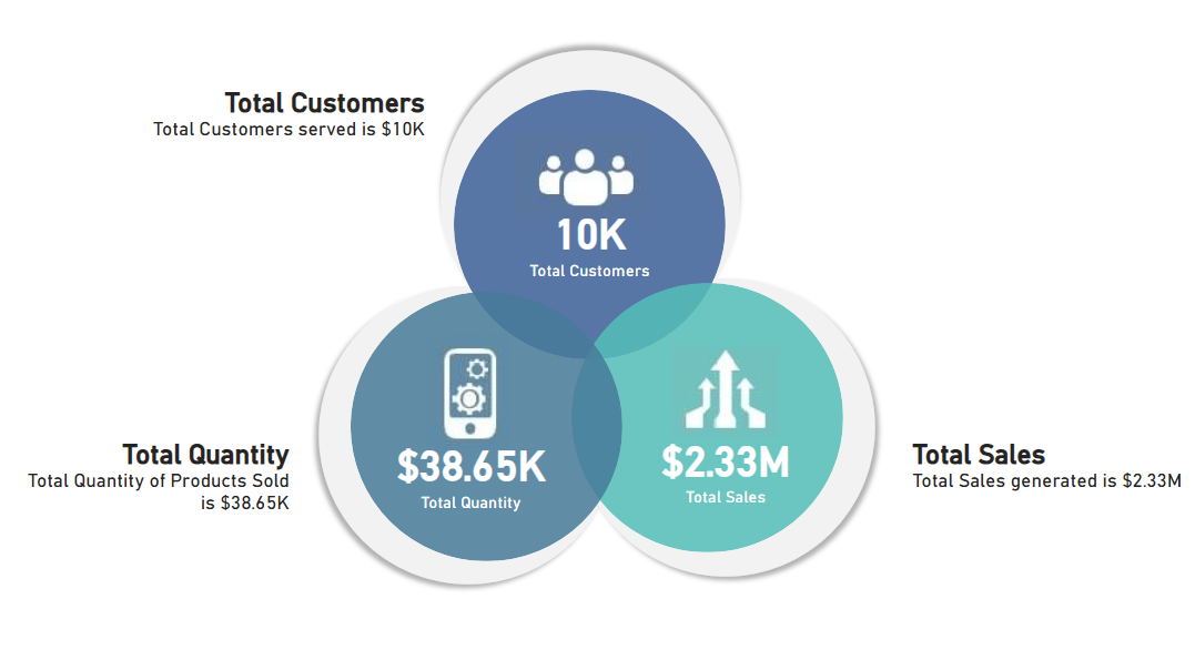
- In the Insert tab select Text box and type “Total Quantity of Products Sold is $38.65K”.
- Set Font to DIN, set heading size to 20 and Inference text to 12, Bold the heading, place it next to Quantity KPI.
- Set alignment to Right.
- Copy the Quantity text box, and type “Total Customers served is $10K” and use the same formatting as the Quantity text box.
- Place it next to Total Customers KPI.
- Copy the Quantity text box and type “Total Sales generated is $2.33M”.
- Set Font to DIN, set heading size to 20 and Inference text to 12, Bold the heading, place it next to Sales KPI.
- Set alignment to Left.
By the end of this article, you’ll have a clear understanding of how to create a Venn Diagram-style Sales KPI in Power BI, enabling you to visualize and analyze your sales data more effectively.
Leave a Reply